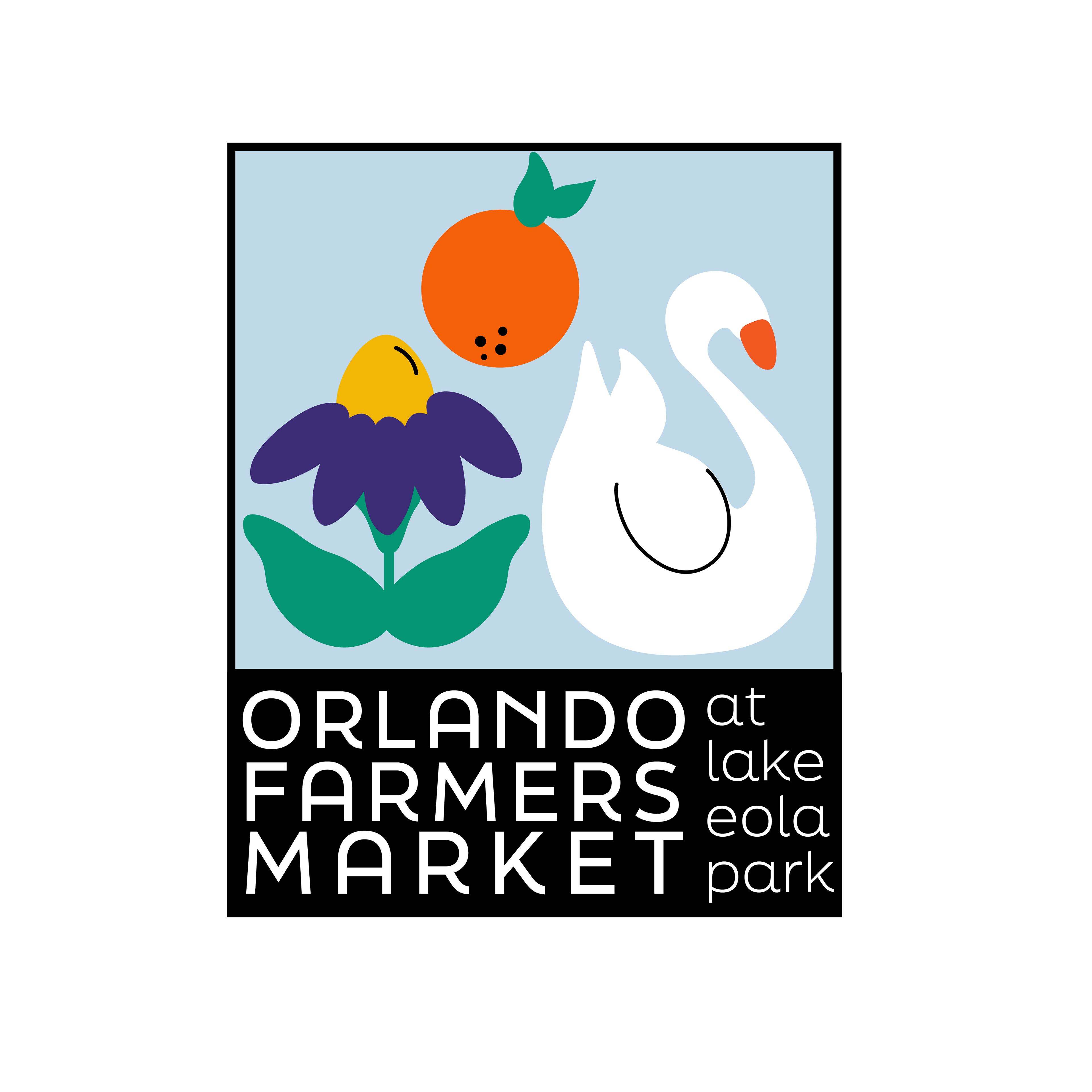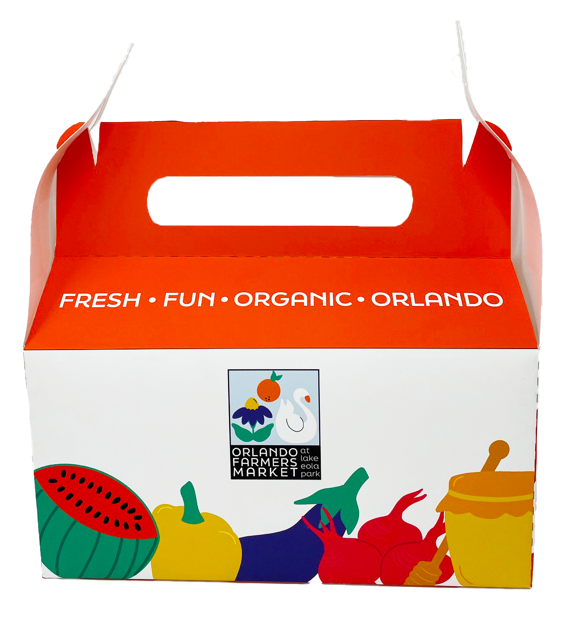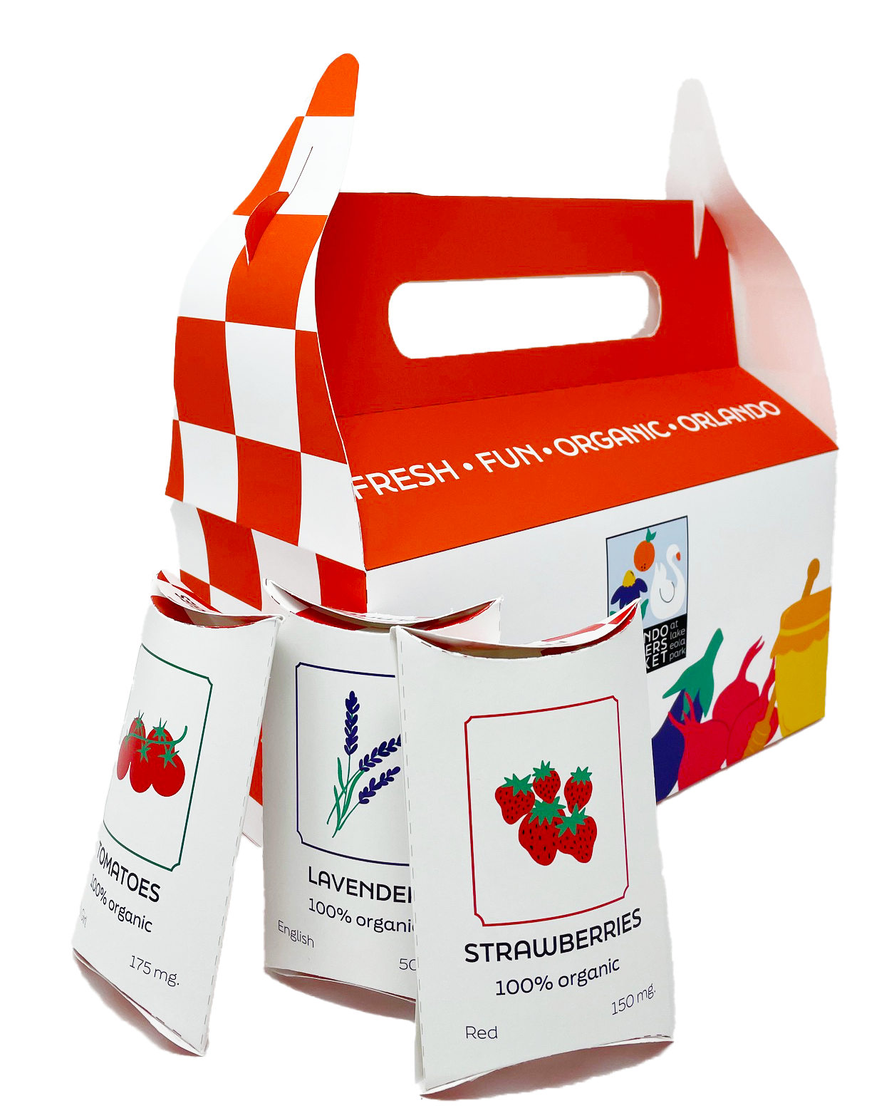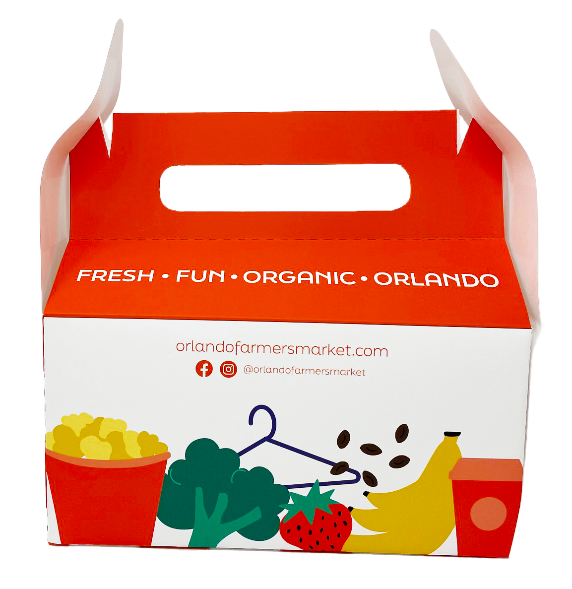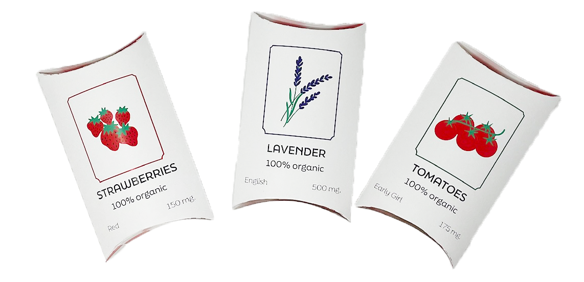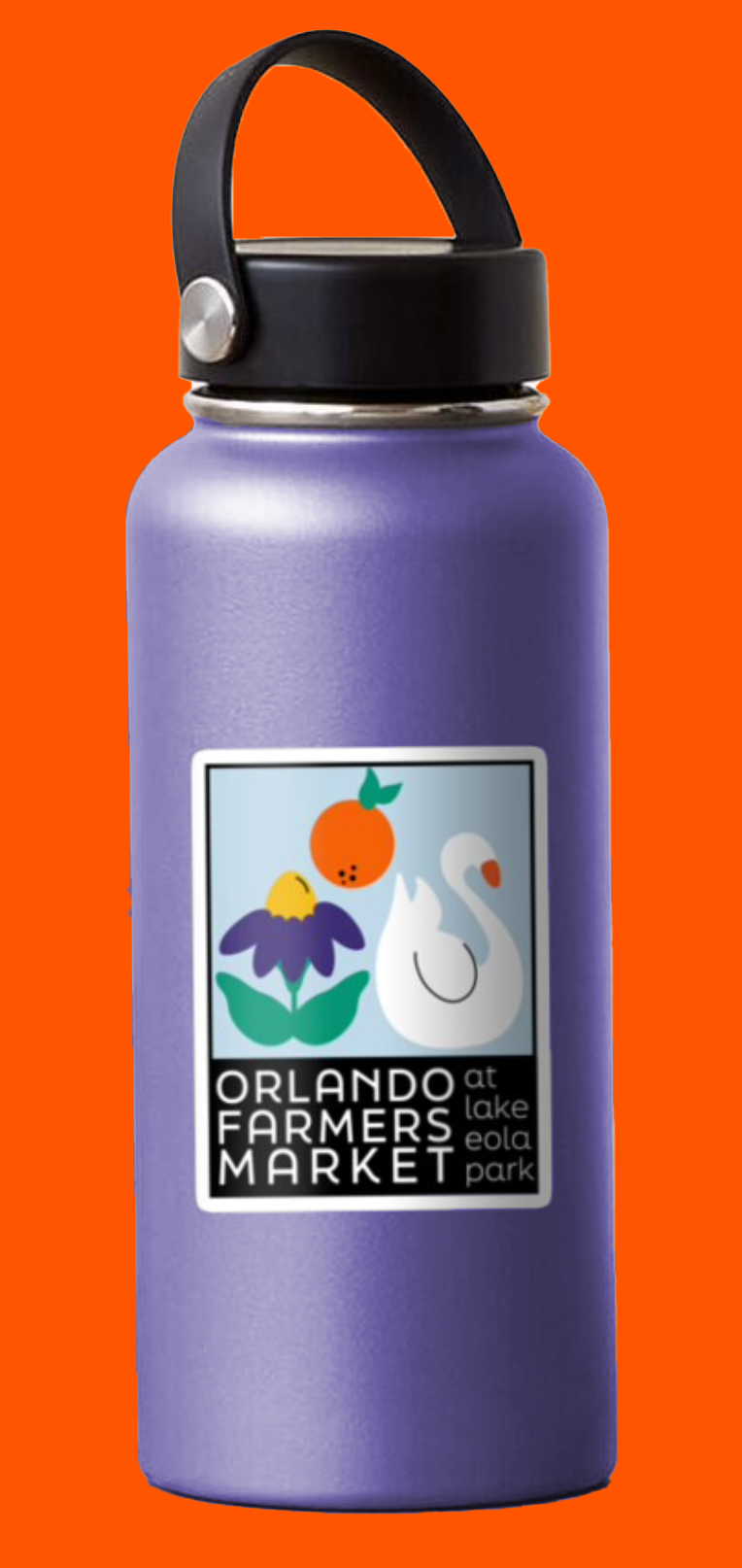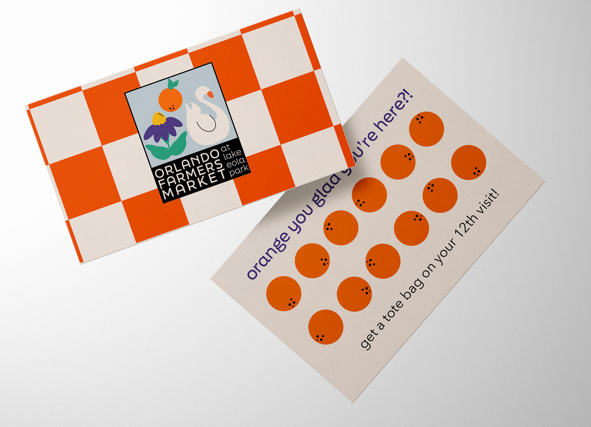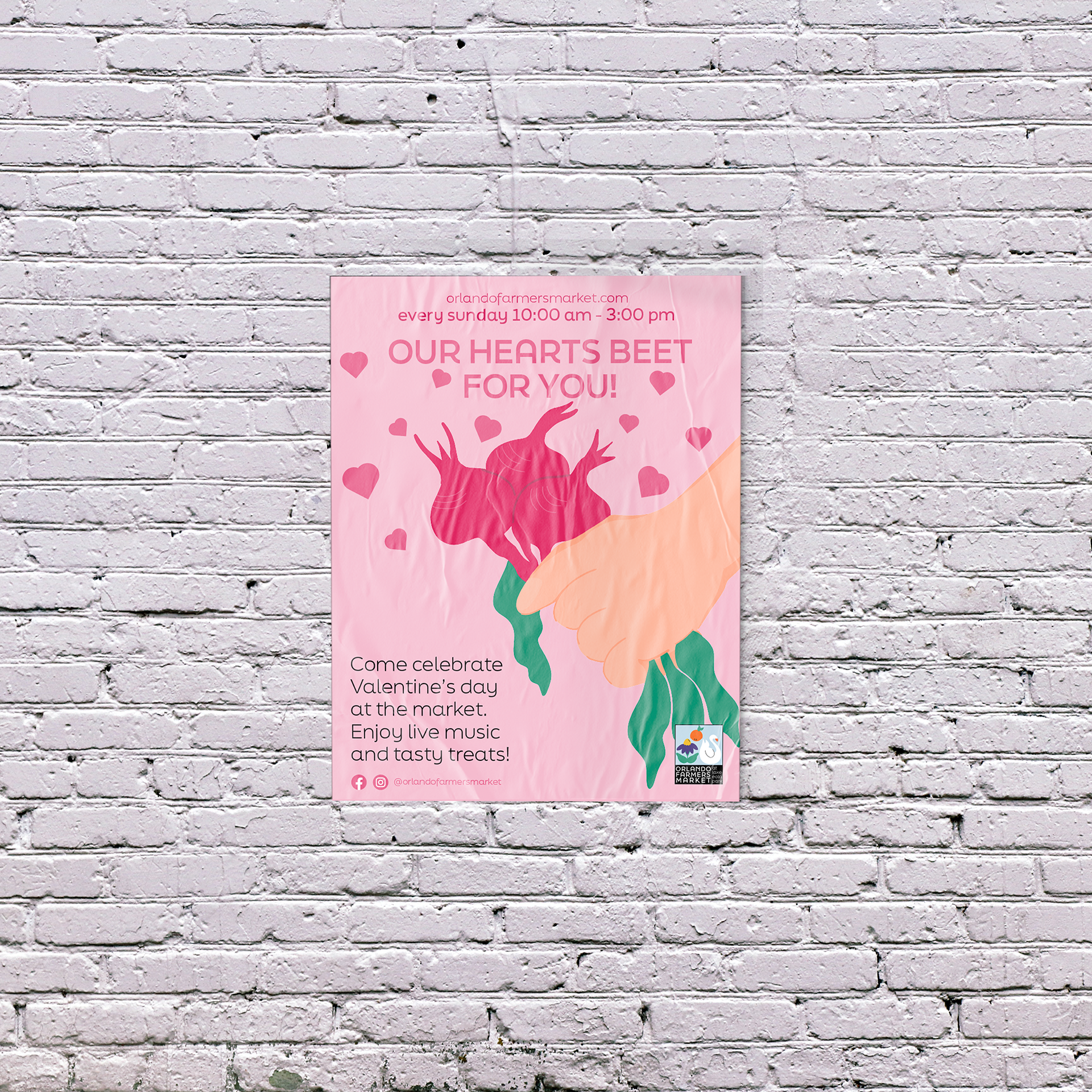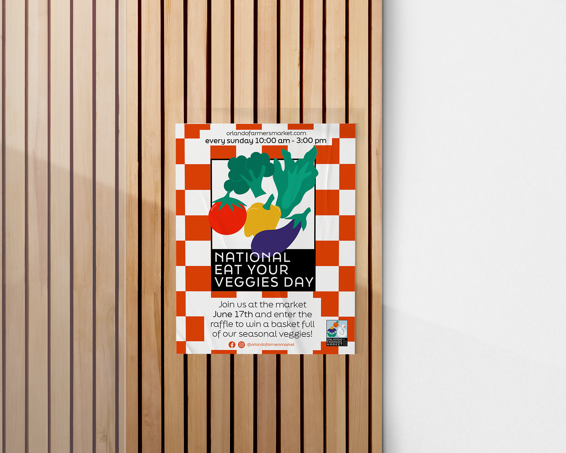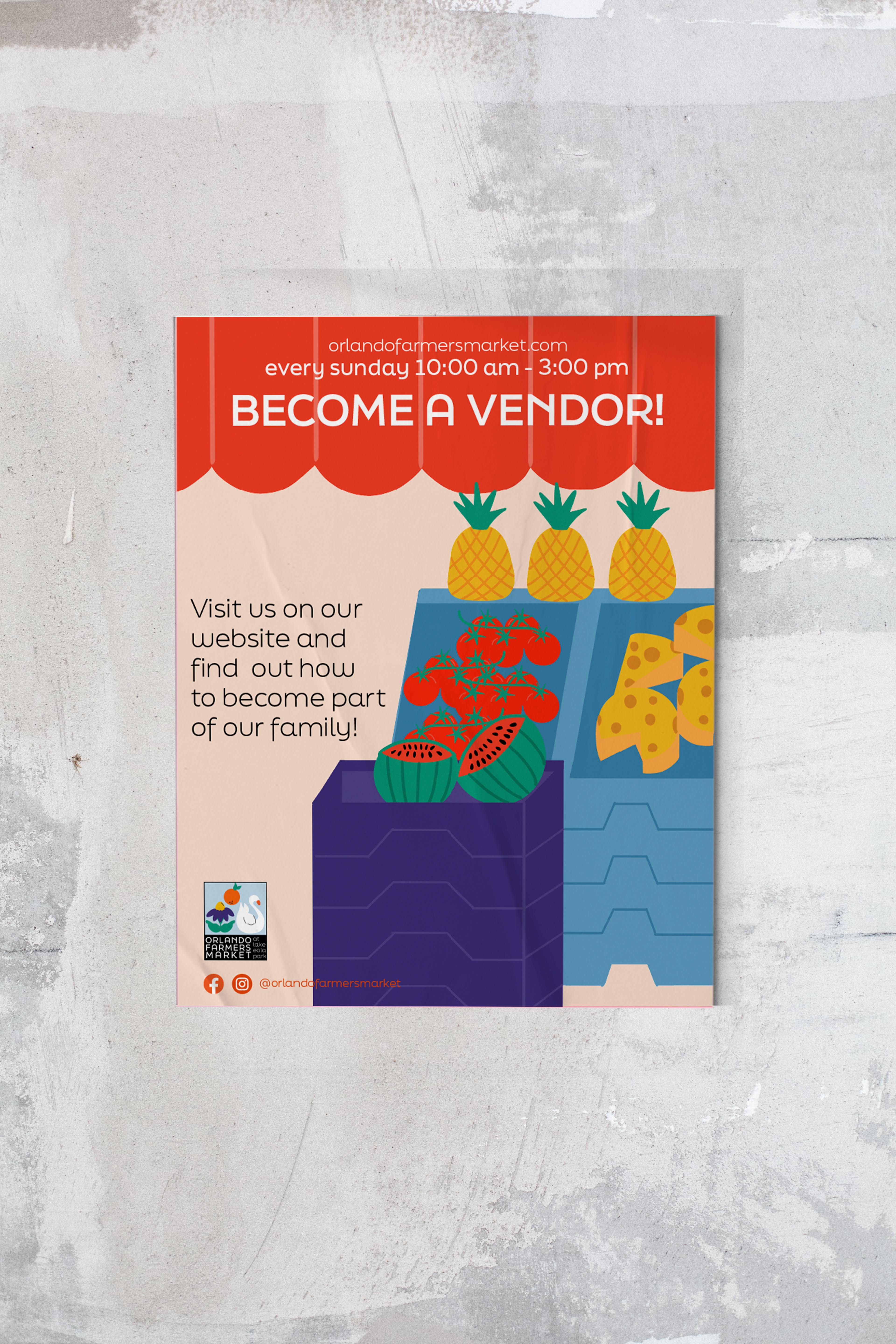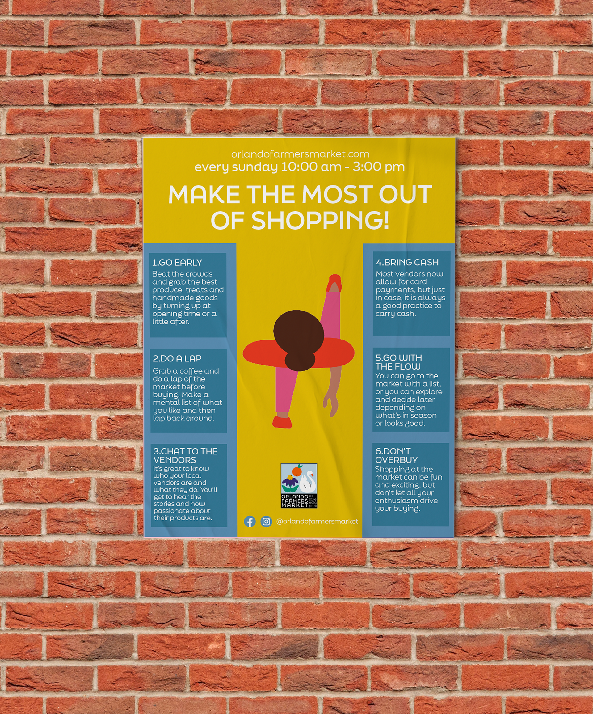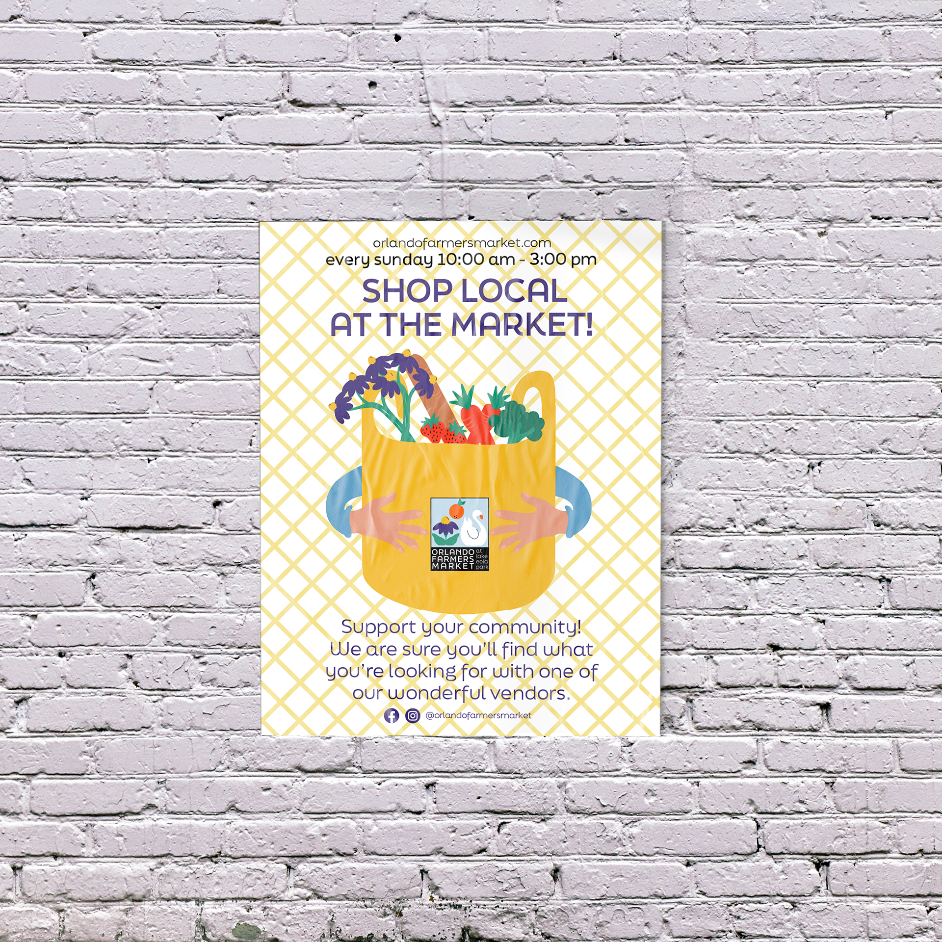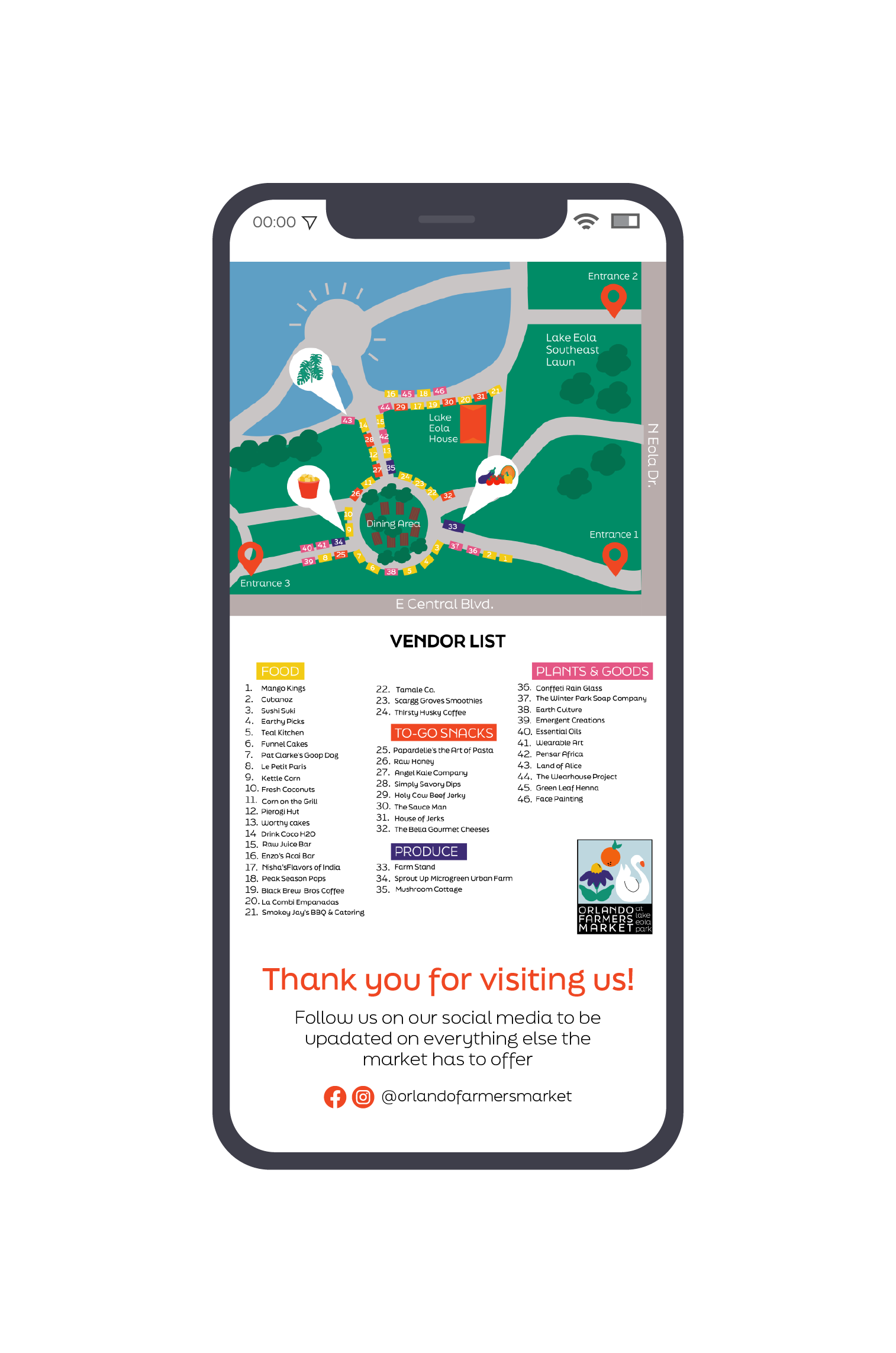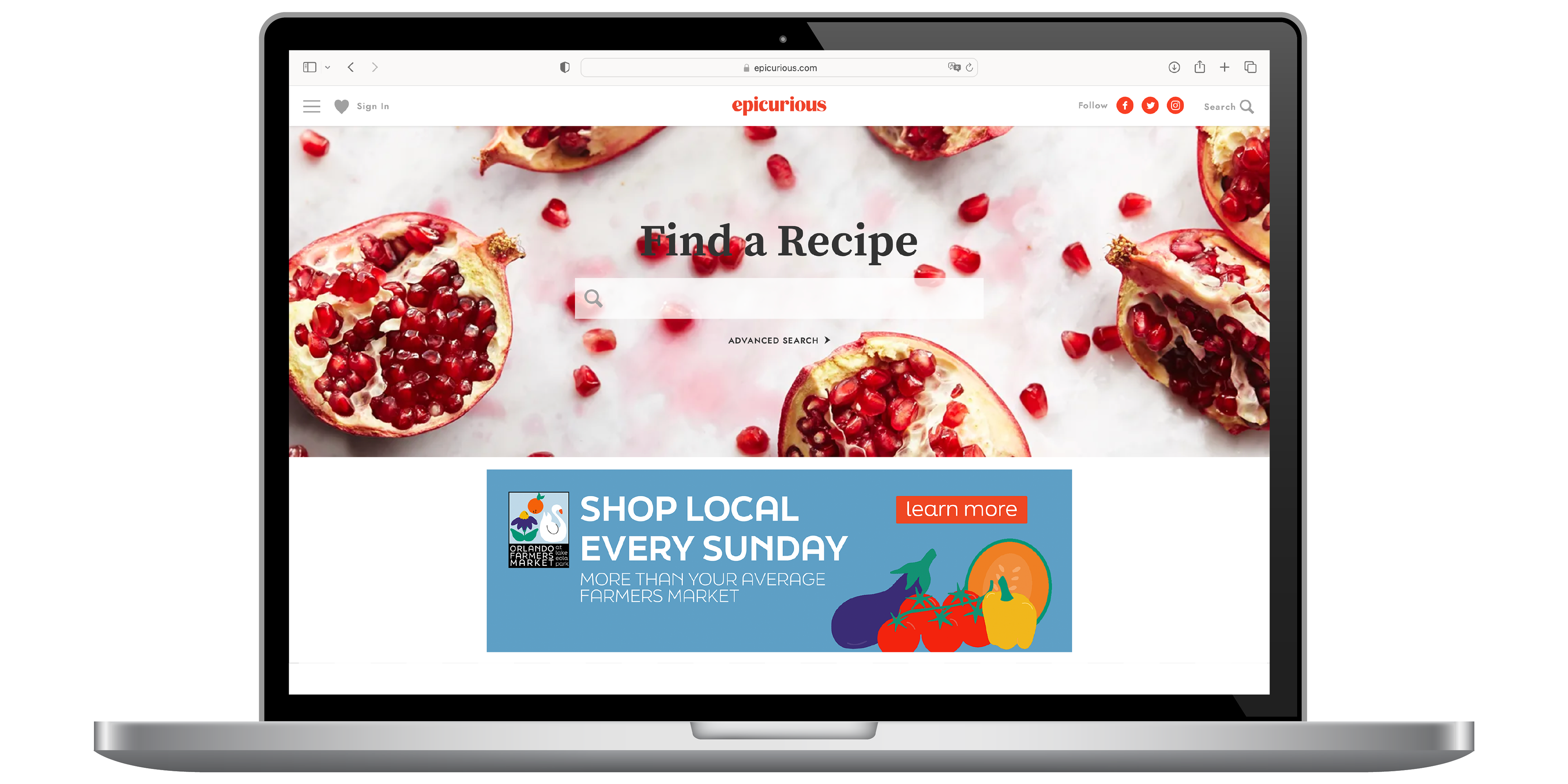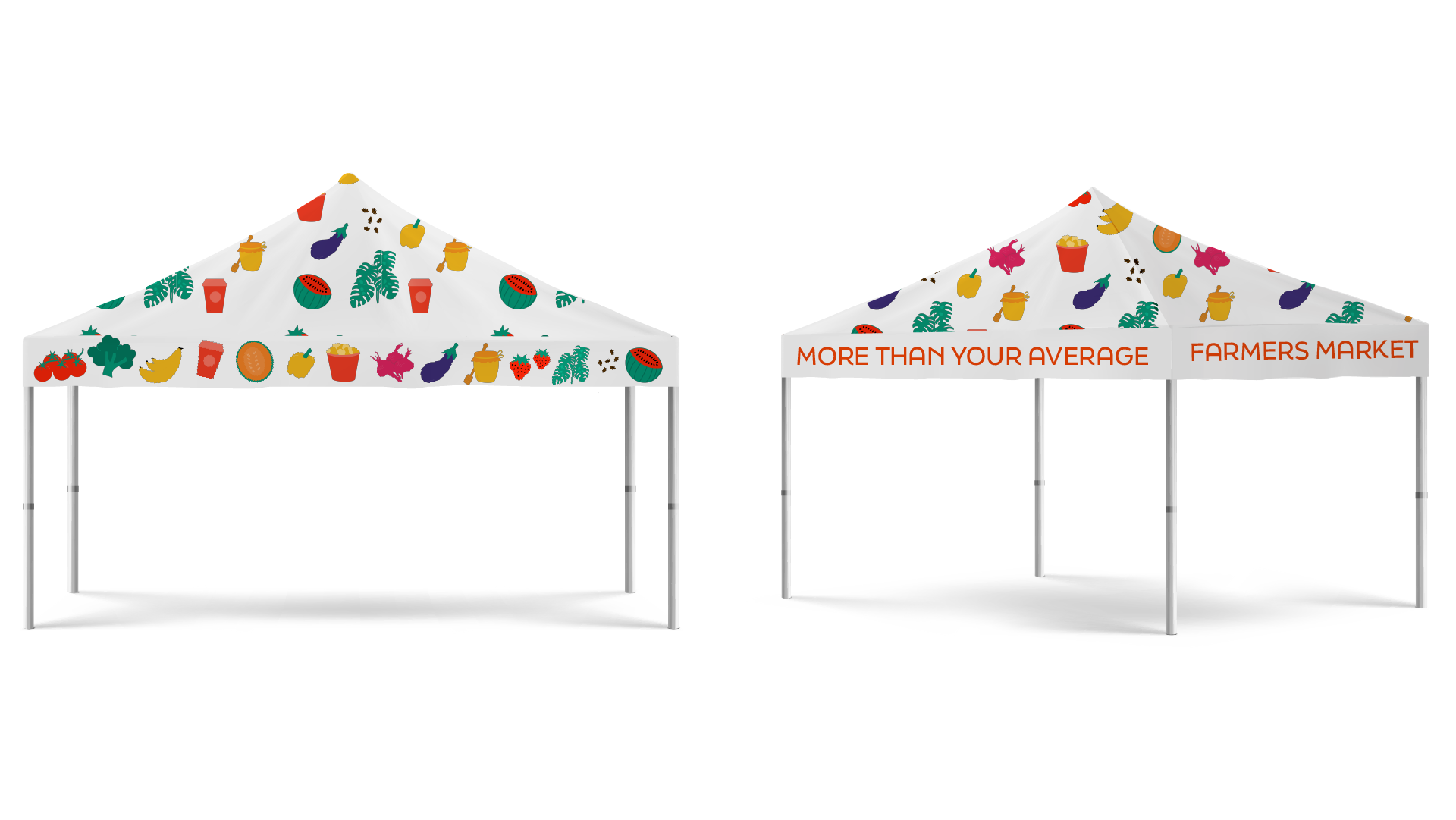
Re-branding the Orlando Farmers Market has been one of the projects I’ve had the most fun designing. The slogan of the market is “More than your average farmers market”, and I took that as an inspiration in order to illustrate the fun and iconic side of Orlando in general. The flat, illustrative design of the logo is incorporated through the whole brand. From a goodies box, to seed packs, stickers, and even more. The playfulness and colorful side of Orlando is one to be highlighted and in response, be memorable to all who visit.