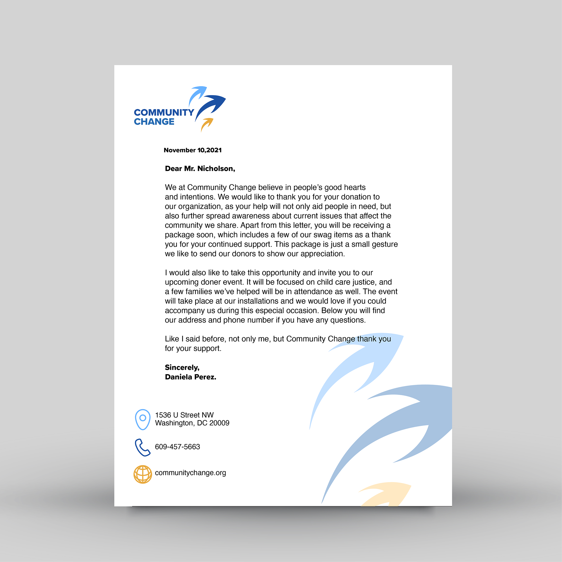
The re-brand of Community Change was part of a project working on giving non-profits a fresher and innovative look. Community Change is a non-profit organization that helps and empowers people of color to fight for better living conditions. Their mission is to create political change through a united community and impulse society on a better path through the organization of campaigns, peaceful protests and political advocacy.
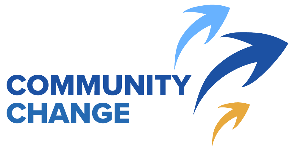
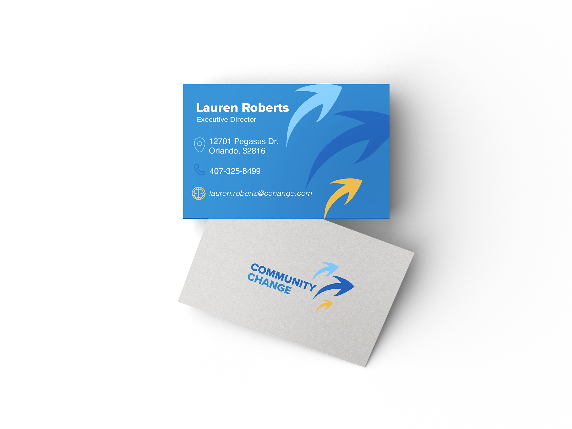
Keeping the organizations main ideals, the logo depicts three arrows alluding to community and togetherness. The idea of direction was a fundamental part when designing, as I wanted to incorporate movement to what was before a static logo. The three arrows moving together were created to represent the change that can be achieved, fusing the power organized people, bold ideas, and political influence.